The Objectives Chart page displays a variety of charts for objectives and sub-objectives. It displays the same priorities as the Objectives Grid.
Columns Chart
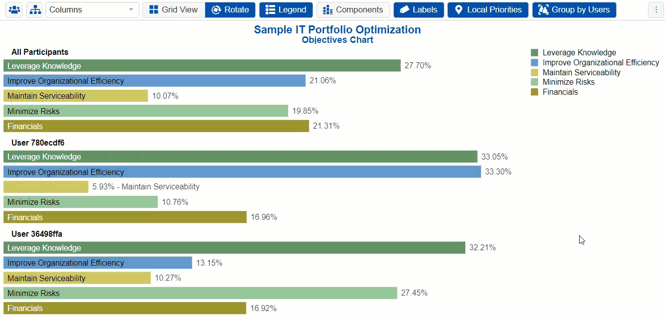
By default, the Columns chart is displayed. The columns chart below has the hierarchy enabled, which is why you can see and traverse the objectives hierarchy on the left.

Clicking another objective node on the Objectives hierarchy at the left will show the chart for the sub-objectives with respect to that node.

You can select one or more participants or groups using the icon.
icon.
If more than one chart is available, pagination is displayed at the bottom of the page:
- Charts per page (left) - select how many charts to display per page
- Pagination (right) - paginate or select the page to display

Various options are displayed on the toolbar at the top of the charts. Depending on a chart type, options may only be available to a specific chart type.
For non-advanced mode, the following options are available for Columns Chart.

- Rotate - rotate chart 90 degrees with each click.


- Legend - Show or hide the objectives charts legend


- Components - Show or hide objective components

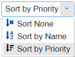
- Sort - sort chart by priority, name, or none (default: none)
- Export - export as png, SVG, pdf, or multiple pdf

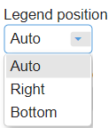
- Legend Position - can be auto, right, or bottom of the chart (default: Auto)
- Decimals
- Font
Select from the Font size dropdown (14 as the default).
The Auto font size check box is only applicable for column charts - Grid View


This option is available for all chart types (except for Stacked Bars) when more than one participant or group is displayed. This allows you to display the charts in grid view (multiple columns) when ON, or a single column when OFF.
TIP: All chart types have the same common options as above for non-advanced mode, except for Components which is only available for Columns.
HINT: For smaller screens, some of the options may be hidden. You may see the hidden options by clicking the ellipses  (snowman) icon at the top right.
Columns Chart with Components
You can show the column charts with components by toggling the  button.
Objectives Charts with Components displays the breakdown of each sub-objective's contribution to the priority of its parent objective.

For Non-advanced mode, two chart types are available: Columns which is displayed above, and the Hierarchical pie:

Hierarchical Pie Chart
A hierarchical pie chart is a visual representation of the hierarchy of Objectives.
The center circle pertains to the Overall Goal.
The first layer segments are the first-level sub-objectives of the hierarchy -- the "Improve Organizational Efficiency," "Minimized Risks," and so on....
The second layer segments are the sub-objectives of the first-level nodes which have a lighter shade color of their parent.
In the example below, the "Maintain Serviceability" objective has sub-objectives: Scalability, Responsiveness, and Resources.

When the Advanced mode is ON, you can check or uncheck the  checkbox.
The chart above has the Area Mode ON; that is, the sum of the sub-objectives' segments area is equal to their parent's area.
When the Area Mode is OFF, all the segments will have the same height as shown below:

The hierarchical Rotate option rotates the chart counterclockwise by 45 degrees with each click.

TIP: If some of the labels are being blocked by the toolbar at the top, the rotate option will be helpful.
You can click on a parent node on the chart or from the legend, to zoom to a lower cluster of the hierarchy:

Clicking the same node will return to the overall chart.
Advanced Mode Charts (Pie, Donut, and Stacked Bars)
When the Advanced mode is ON, additional chart types are available:

Pie

Donut

Stack Chart

DIDN'T SEE WHAT YOU ARE LOOKING FOR? Try enabling the Advanced Mode switch at the bottom of the page; this will show the advanced options on this page.
Advanced Mode Options
When the Advanced mode is ON, additional options are available; some options may be available only on a specific chart type.
Available for all Chart types:
- Labels - show or hide chart labels or objectives names on the chart. This will only show the percentage priority on the chart. You can then show the legend instead.

- Local Priorities - toggle between local objectives priorities (blue button) or global objectives priorities (grey button).

- CIS - If the Combined Input Option (CIS) is ON, then results for individuals are computed by combining the priorities derived from judgments/ratings that they have roles for. For judgments that they do not have a role for, they are assigned the combined results for those who do have a role.

- User Priorities - If priorities (weights) have been specified for participants, you can use the "User Priorities" check box which enables you to apply or ignore these priorities in calculating the results. User Priorities is set up from the Participants screen.


Chart Specific Options:
- Group by Users - available for Columns chart when multiple users/groups are selected. By default, this option is ON. When Group by Users is OFF, the chart is grouped by elements or nodes.
- Area Mode - available for Hierarchical Chart. This displays the sub-objectives segments on the chart based on its parent's segment size. See the hierarchical pie chart section above for more details.

