The Alternatives Chart page displays the same priorities as the Alternatives Grid.
Alternative Charts Overview
By default, the Columns chart is displayed. The column chart below shows the alternative priorities with respect to the overall Goal.
You can view other chart formats when Advanced mode is enabled.

Clicking another objective node on the Objectives hierarchy at the left will show the chart for the alternatives with respect to that node.

From the above, we can see the Alternatives with respect to the Objective "Improve Organization Efficiency."
You can hide the Objectives Hierarchy at the left using 

You can select one or more participants or groups using the icon.
icon.
If more than one chart is available, pagination is displayed at the bottom of the page:
- Charts per page (left) - select how many charts to display per page
- Pagination (right) - paginate or select the page to display
Non-advanced Mode options (Normalization, Rotate, Legend, Sort, etc.)
Various options are displayed on the toolbar at the top of the charts. Depending on a chart type, options may only be available for a specific chart type.

- Normalization - By default, the Normalized results are displayed. When the Advanced mode is ON, you can display results based on other normalization options:

- Unnormalized (The priority is the sum of the products of each covering objective's global priority times the priority of the alternative with respect to each covering objective). If an alternative has a priority of 1 for every covering objective, it will have an unnormalized priority of 1 and is referred to as an ideal alternative. Note: "Unnormalized" is not available and not applicable when using the Distributive mode.
- Normalized for All (sum to 1 for all the alternatives).
- Percentage of Maximum (the alternative with the highest priority is 1 and all others are a percentage of this).
- Normalized for Selected (sum to 1 for the selected alternatives).
- Rotate - Click the rotate button to rotate the chart by 90 degrees at a time.


- Legend - show or hide the Legend.


- Components - Show or hide the alternative components. See more details here.

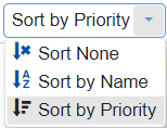
- Sort - sort chart by priority, name, or none (default: none).
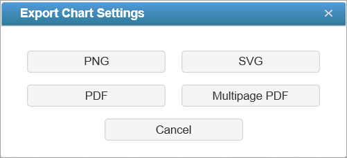
- Export - export as png, SVG, pdf, or multiple pdf.

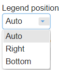
- Legend Position - can be auto, right, or bottom of the chart (default: Auto). Legend position is only enabled when the Legend is displayed.
- Decimals
- Font
Select from the Font size dropdown (14 as the default).
The Auto font size check box is only applicable for column charts - Grid View


This option is available for all chart types (except for Stacked Bars) when more than one participant or group is displayed. This allows you to display the charts in grid view (multiple columns) when ON, or a single column when OFF.
TIP: All chart types have the same common options as above for non-advanced mode -- except for Components which is only available for Columns.
HINT: For smaller screens, some of the options may be hidden. You may see the hidden options by clicking the ellipses  icon at the top right.
Alternatives Chart with Components
You can show the column charts with components by toggling the show (or hide) components button.
Alternative Charts with Components show the priority of each alternative divided into sections showing how much of the priority is due to its preference with respect to each of the objectives.

Hovering on a specific component will highlight that element for all the alternative bars. A tooltip will also be displayed to see its details -- ([Participant or Group Name]: Percentage Priority Alternative Name) as shown below:

DIDN'T SEE THE OPTION YOU ARE LOOKING FOR? Try enabling the Advanced Mode switch at the bottom of the page; this will show the advanced options on this page.
Advanced Mode Options
When Advanced mode is ON, you will see the advanced options on this page (see highlighted):

1. Chart Types
More chart formats are available in the advanced mode.

The Columns chart is selected by default. You can select from other chart types available. The selected chart format on the advanced mode will be remembered when you switch back to the non-advanced mode.
Pie chart 

Donut Chart 

Stacked bars 

2. Filter Alternatives
By default, all alternatives are displayed.

You can display the top 5, 10, or 25 alternatives based on the "All Participants" group priorities.
3. Labels
Show or hide chart labels or objectives names on the chart. When hidden, only the priorities are shown on the chart. To compensate for the loss of labels, you can choose to show the legend instead.

4. Group by Users
Group by Users is available for Column charts when multiple users or groups are selected. By default, this option is ON. When Group by Users is OFF, the chart is grouped by element or node.
5. Combined Input Option (CIS)
If the Combined Input Option (CIS) is ON, then results for individuals are computed by combining the priorities derived from judgments or ratings for which they had roles, with the combined results for any parts of the model where they did not have a role.

6. Apply User Priorities

If priorities (weights) have been specified for participants, use the "User Priorities" check box to apply or ignore these priorities when calculating results.

7. Include Ideal Alternative

8. Ideal and Distributive Synthesis
Results can be computed as an Ideal mode (default) or Distributive mode synthesis. In most cases, the selected synthesis mode has very little, if any, impact on the results. Read the section below for more information.
Originally, AHP had only one synthesis mode – later called the "distributive" synthesis mode. A distributive synthesis distributes priorities from the goal down through the alternatives and is analogous to dividing priorities in a pie chart, which is intuitive for decision-makers to comprehend. The sum of the global priorities for each alternative with respect to each covering objective represents the overall priority of that alternative. The priorities have ratio scale properties (as well as, of course, interval, and ordinal properties) which means that they can be used in making a choice, or in allocating resources. This synthesis operation can be thought of as distributing the goals priority of 1.0 to the alternatives under consideration and is today called the distributive synthesis mode. Originally, this was the only synthesis mode of AHP. Critics of AHP pointed out situations where a different synthesis mode is more appropriate.
The ideal synthesis mode of AHP was introduced for situations where the introduction of new alternatives to a decision might - using the distributive synthesis mode - cause the ranks of existing alternatives to change, even when none of the judgments with respect to the original alternatives are changed. There are some situations where it is reasonable for the ranks of existing alternatives to change, and others where it is not.
For even more information, see https://comparion.knowledgeowl.com/help/ideal-and-distributive-synthesis-closed-and-open-systems
9. Aggregating Individual Priorities (AIP)
Selecting AIP from the Combined Mode drop-down will show results based on aggregating individual priorities, known as AIP, instead of aggregating individual judgments (AIJ). AIJ is the default. When AIP is selected, overall alternative priorities are computed for each participant and then an average of these priorities is computed.

NOTE: Due to the nature of AIP, objectives charts, objectives grid, and all sensitivity analysis pages are disabled when AIP is selected.
